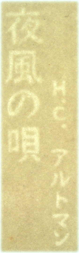
H.C. Artmann
nachtwindsucher | yokaze no uta
Österreichische Haiku
Japanese translation by Midorikawa Masumi.
With seven original woodcuts by Michael Schneider
and one calligraphy by Shuka Hiiro.
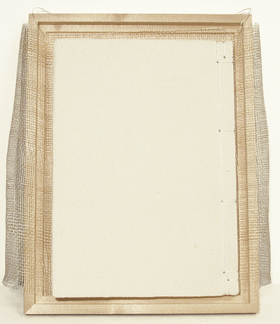
Book cover: Softcover, in spruce and poplar wood box
Binding: Japanese bookbinding (kangxi)
Paper/cover: Handmade Japanese paper
Paper/book block: Japanese paper (kozo-shi)
Print/cover: Book title and author's name as watermark
Print/book block: Letterpress print from polymer plates
Font(s): Times New Roman
Size: 25,5 x 18 cm
Weight: 300 g
Number of pages: 81 pp.
Number of illustrations: 7 woodcuts, black
Language(s): German / Japanese
Year of publication: 1996
Edition size: 100 numbered & signed copies
Euro 850,00
(10 % VAT incl., shipping excl.)
Project description (1996):
"This is the first German-Japanese edition of the haiku
collection nachtwindsucher by Austrian poet H.C. Artmann, formerly published, in German only, at Rainer Verlag, Berlin 1984; concept by Elisabeth Parth.
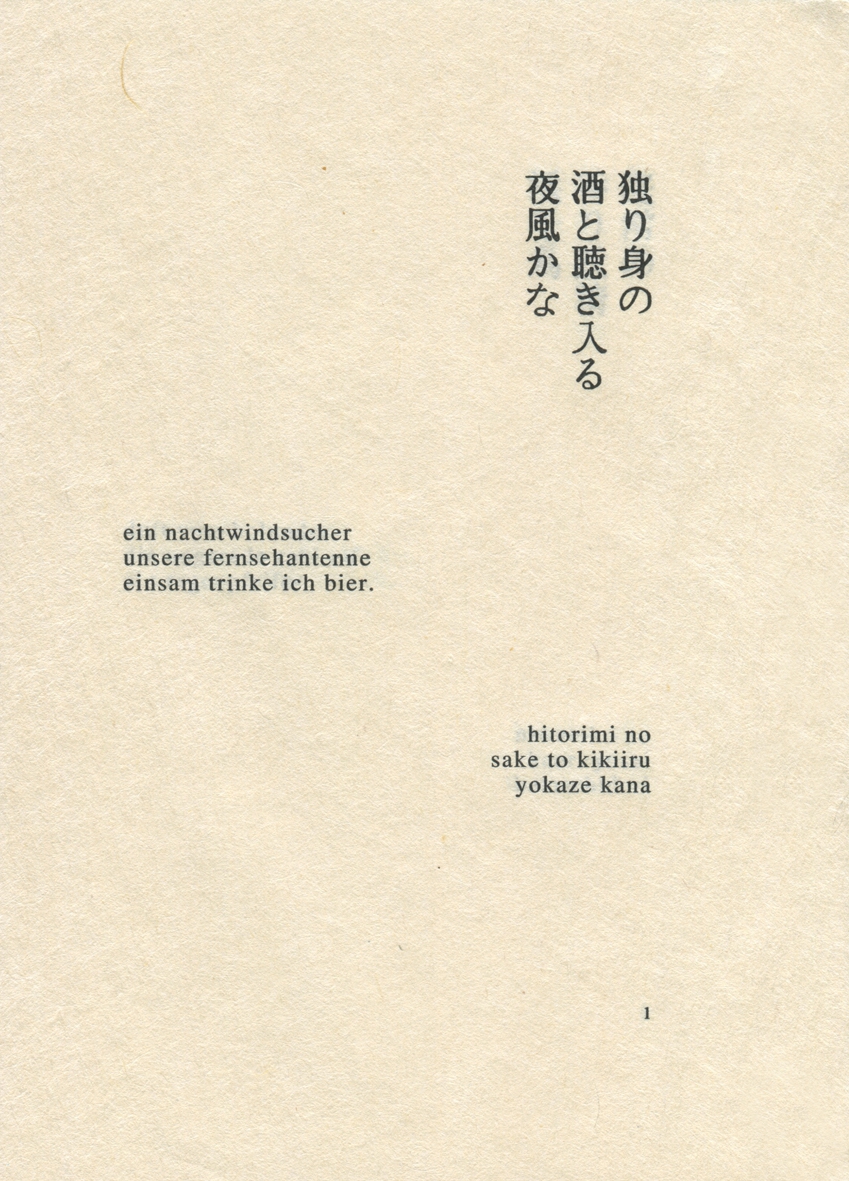
It would also be justified to call this book trilingual: in addition to the original German version, the translation into Japanese and its writing in Japanese characters (kanji and kana), every haiku is repeated in a romanized transcription (romaji after Hepburn) allowing for the pronunciation of the kanji and kana symbols.
Making the phonetic side of the Japanese translation accessible was the explicit wish of the author.
The Japanese title is pronounced yokaze no uta and literally (re)translates into songs or poems of the nightwind. First and foremost, the translator Midorikawa Masumi considers himself to be a mediator between two highly different linguistic systems, socio-cultural contexts and Weltanschauungen, between the fabulous haiku world imagined by an Austrian poet and the haiku-experienced Japanese reader. The translation is a free adaption.
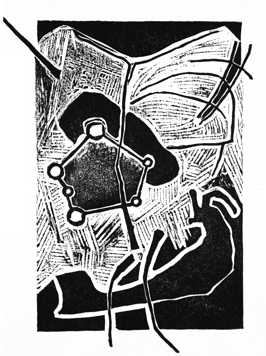
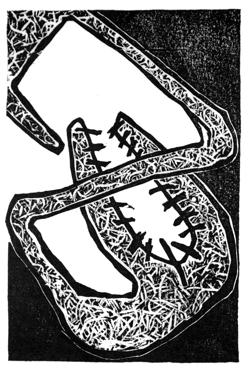
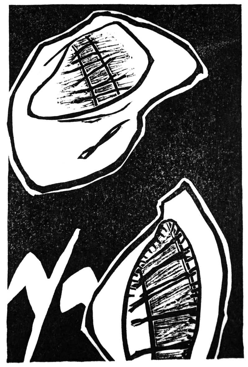
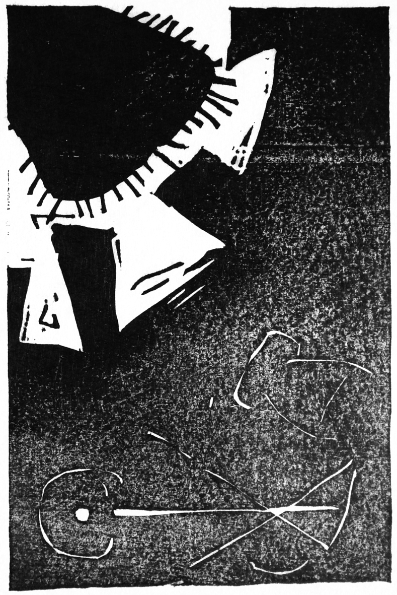
Michael Schneider created seven small woodcuts especially for this publication. Abstract compositions of dark scarcely worked parts, cut lines and worked out spaces do not intend to illustrate the haiku but act on formal principles of the haiku poetry: equally to the haiku which offers a fascinating interaction between indication and outspokenness of the material for the reader’s own construction of pictures and atmospheres, the prints allow the spectator to construct spaces, signs and pictures, and they show an interplay of clear forms and open, ambiguous compositions.
Due to the limited edition of 100 copies and the special quality
of the paper, the prints in each copy are originals, hand-printed with Japanese sumi (ink) without using a press.
Birgit Riepl took over the printing process whenever Michael Schneider's arm got too weak.
The book was printed on selected high-quality Japanese paper (washi), which would not have allowed for traditional off-set printing. Therefore, the more elaborate letterpress printing was chosen, giving all characters, Japanese as well as roman, a satiated depth that compliments the paper’s natural tone.
Bruno Gitterle produced the needed polymer plates and carried out the book printing.
The cover is made out of kozu and pulp from a single sheet of paper and contains the book-title as well as the author’s name as watermark. It was produced by Washi no Sato, a renowned family business in Higashichichibu-mura/Ogawamachi, Saitama prefecture, and one of the leading master-papermaker in the region Chichibu which is famous for its long tradition of this old craft and the production of high-quality washi.
Originally, books in Japan had been bound according to Chinese tradition, meaning they were sewed by hand at one book margin. Nowadays, this binding style can also be done mechanically which led to a massive decrease in the number of craftsmen who are still able to work in this old technique.
The binding of this haiku edition has been hand-sewed by one
of the last remaining craftsmen located in the Chichibu region."


contact | info
projects
literature
artist's books
about us
book art
e d i t i o n